BRAND IDENTITY
Safe S3X 4U
DISCIPLINE
BRAND IDENTITY
MEDIUM
PRINT & CAMPAIGN

THE WORK
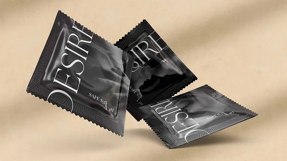
Safe S3X 4U is a self-initiated brand identity designed to destigmatize sexual health for young women. The brief was cultural, not commercial: sexual health products have historically been packaged in the visual language of clinical anxiety — muted palettes, pharmaceutical typography, implied shame. This project asked what the opposite could look like.
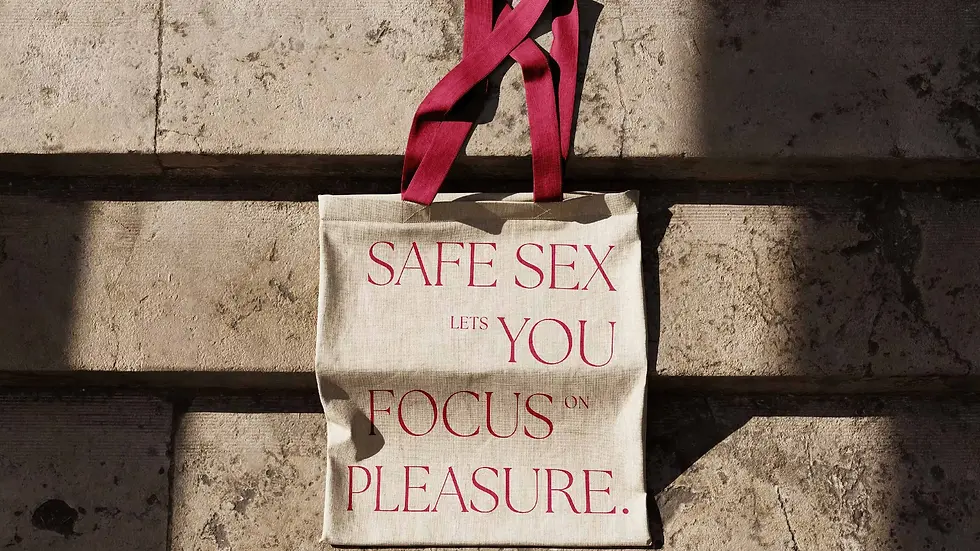
The answer came from fashion editorial. Luxury magazines have always treated the body as something worth celebrating rather than managing. Safe S3X 4U borrows that visual grammar — the serif hierarchies, the generous white space, the confident tone — and applies it to products that have never been given that kind of design attention. The core philosophy was a single line: safe sex lets you focus on pleasure.
It won GDUSA's Digital Design Award, MUSE Gold for Brand Identity, London Design Awards Gold for Communication Design, and Titan Health Awards for Branded Content, all in 2026. It was featured on Dezeen.

PROCESS
The visual system was built around restraint. The palette is muted but warm — colors drawn from skin, paper, and the specific neutrals of high-fashion editorial rather than the blues and greens of pharmaceutical design. Typography is serif throughout, set with the kind of spacing that signals quality rather than urgency.
Every decision was tested against the same question: does this look like something you'd be embarrassed to carry? The tote bag, the notebook, the billboard — each object had to work as an artifact you'd keep, display, or want. That standard shaped everything from the logo weight to the copy voice.
THE CAMPAIGN
The campaign lives across objects: tote bags, branded notebooks, out-of-home billboards. Each one carries the visual identity into a different context — carried on a shoulder, left on a desk, read in passing on a street. The goal was to make sexual health a visible, normalized part of public space rather than something confined to a pharmacy aisle.
The billboards in particular were designed for the gap between message and medium: content that has historically appeared only in clinical contexts placed in the visual register of luxury advertising. The dissonance is the point. What feels surprising is what makes it land.