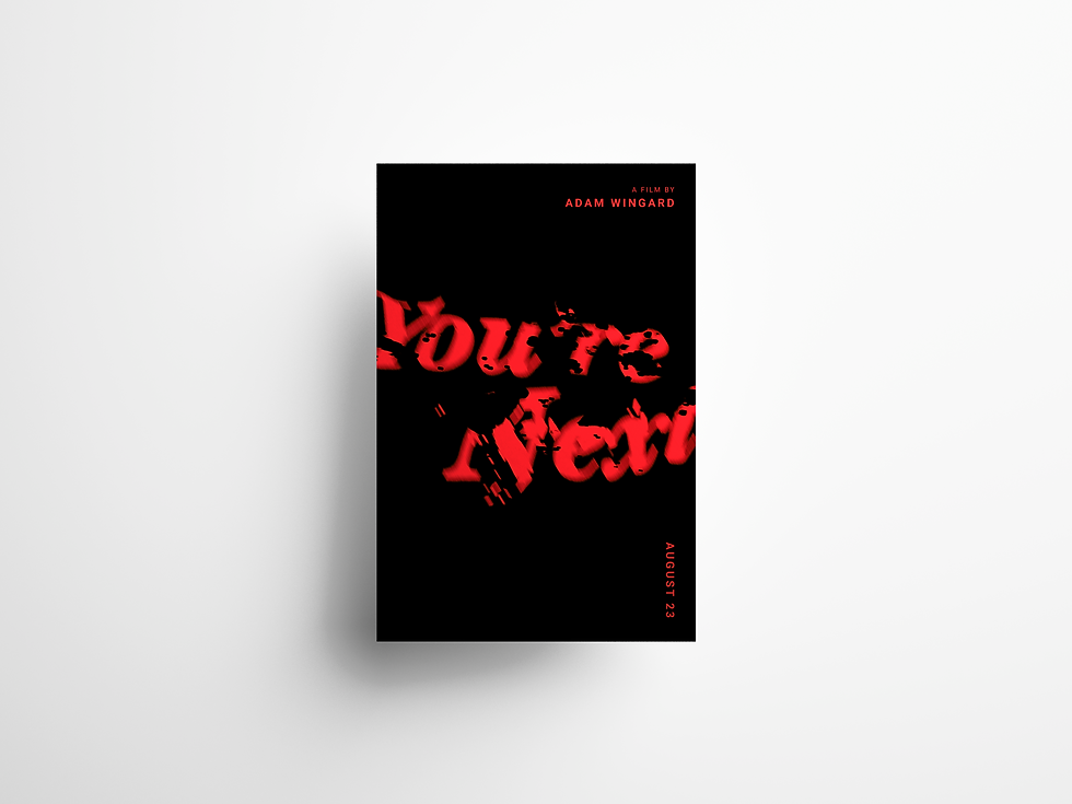
TYPOGRAPHIC POSTER SERIES
You're Next
DISCIPLINE
TYPOGRAPHY
MEDIUM
PHOTOGRAPHY

THE WORK
You're Next is a typographic poster series for Adam Wingard's 2013 horror film. The constraint was simple: nothing could be simulated digitally that could be made physically first. That rule determined everything.
Type was set, printed, then subjected to progressive physical damage — crumpled, torn, submerged, treated with liquids until the paper itself became unstable. These weren't textures sourced from a library. They were made, photographed at the moment of maximum tension between legibility and collapse.
It won a MUSE Creative Awards Silver for Typography in 2026.

PROCESS
In Photoshop, the photographs were composited using blend modes — Multiply, Burn, Overlay — to fuse layers of damaged type, liquid residue, and surface texture into a single image with depth and weight. Opacity and selective blur controlled what read as foreground and what dissolved into atmosphere. Color grading shifted the palette toward the visceral: deep blacks, bloodied reds, the specific quality of light that horror cinematography uses to make the familiar feel wrong.
The posters are graphic design made through photography, physical damage, and controlled accident. The medium and the subject are the same thing.


THE POSTERS
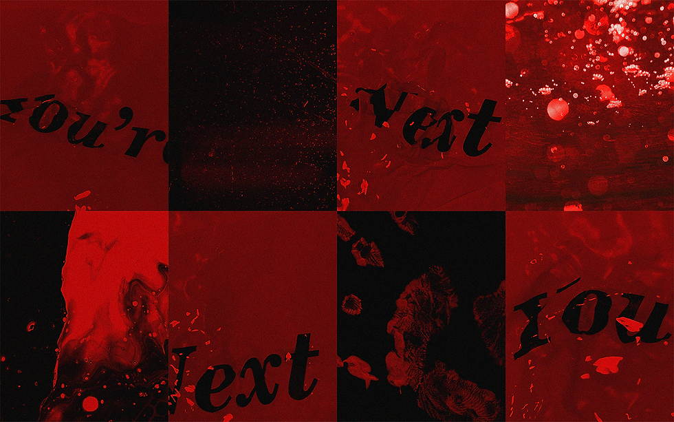
Three posters, each built from a different physical state of the same material — paper submerged, paper torn, paper treated with pigment and residue until the surface stopped being paper. They are not variations of the same design. Each is a distinct document of a specific moment of damage.
The series holds together through palette and weight, not repetition. The bloodied red carries across all three; the black shifts — sometimes absorbing, sometimes cut through with texture. The title appears on every poster but reads differently each time: drowning in one, bleeding in another, barely surviving the third. That instability is intentional. The film is about domestic space that turns violent without warning. The type does the same thing.