BRAND IDENTITY
Frosskin
DISCIPLINE
BRAND IDENTITY
MEDIUM
LOGO, TYPOGRAPHY, COLLATERAL
THE WORK
Frosskin is a data cables and connectivity solutions company serving businesses across India. The category is dominated by international names — Commscope, Nexans — and most local competitors cannot compete on visual credibility. The brief was to close that gap: a system that signals infrastructure-grade precision and technical authority without the detachment of a multinational.
Frosskin competes on speed, local knowledge, and product depth. The brand was built to make that visible before a conversation even starts.
PROCESS
The mark had to do heavy work. In a category where most logos are wordmarks or abstract symbols with no legibility at small sizes, the Frosskin mark is bold, graphic, and immediately recognizable — a form that reads on a tote bag, a cable box, a business card, a truck. The orange is deliberate: warm enough to feel approachable, saturated enough to own a room.
From the mark outward: typography, color system, and collateral built for a company that operates on the ground — fast, physical, and present in a way that multinationals aren't.
THE IDENTITY
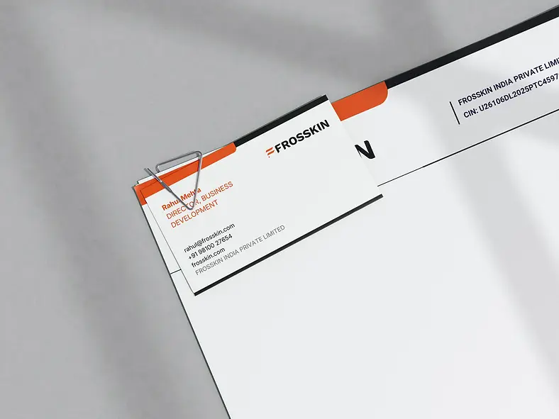
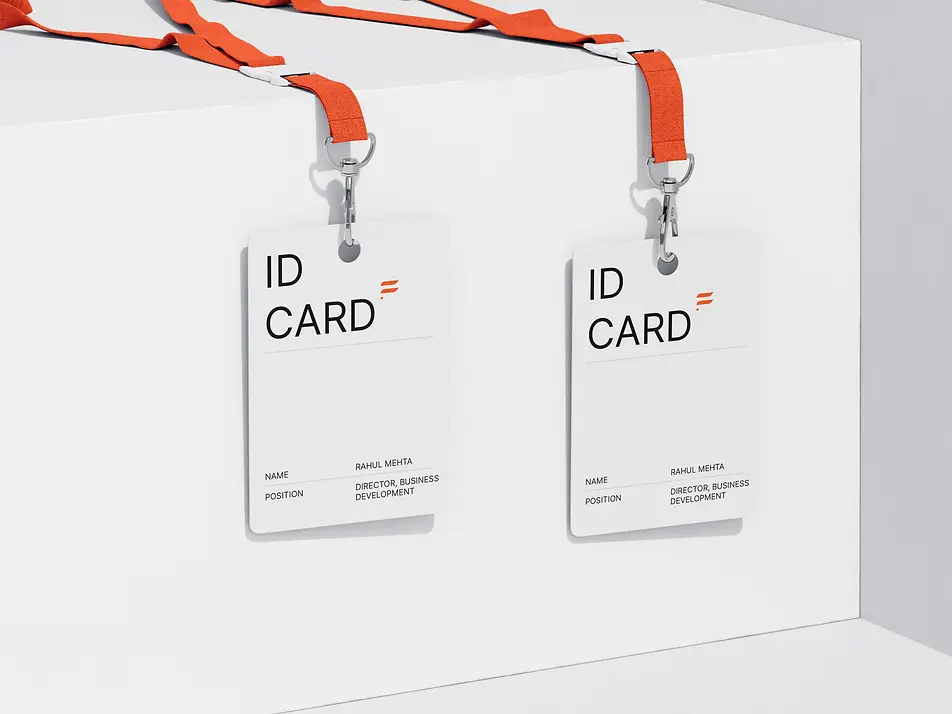
Logo, type system, color palette, and branded collateral. A system designed to hold up in the environments Frosskin actually works in — warehouses, client offices, trade settings — where design either commands attention or disappears.
The orange carries the brand. It's the first thing that reads on any surface, at any scale, in any context. Choosing a color that bold for a B2B infrastructure company is a decision: it says the company is confident enough in what it does that it doesn't need to look conservative. The mark reinforces that — graphic and immediate, nothing hedged about it.
The type system and supporting collateral are built to balance the mark. Where the logo is aggressive, the typography is precise and clean — the combination reads as a company that is both technically serious and visually assured. That tension is what makes the system work. Either quality alone would be ordinary. Together, they position Frosskin as exactly what it is: a local company that can outperform the international names it's competing against, and now looks like it.


