Professional Work and
Conceptual Explorations
A practice spanning brand identity, typography, digital product, and campaign design across technology, security, and health communication. Every project begins with a question underneath the brief — who is this actually for, and what does it need to do for them that nothing else has done. The work collected here is the answer to that question, built with the belief that design earns trust not by announcing itself, but by making the thing it serves feel inevitable and right.

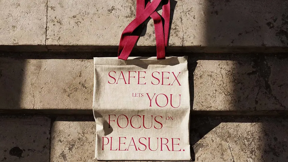

Safe S3X 4U
A self-initiated brand identity built on a single provocation: why has the visual language of luxury editorial — systems that communicate desire, confidence, and sophistication — never been applied to sexual health? Most campaigns in this space are designed around institutional distance, not the person receiving them. Safe S3X 4U closes that gap. High-contrast serif typography, a fashion editorial color palette, and campaign objects chosen to make the message visible in everyday life — not in a clinic, not in a pamphlet, but in public space, carried with intention.
Awards
2026 GDUSA Digital Design Awards
2026 Titan Health Awards — Silver
2026 MUSE Creative Awards — Gold
2026 London Design Awards — Gold


You're Next
A typographic poster series for Adam Wingard's 2013 horror film, built entirely from physical process. Printer letterforms typed on crumpled paper were photographed underwater to produce type that looks like it is drowning. Layers were added to simulate blood on glass. The work looks like graphic design but is actually photography, physical damage, and controlled accident — a series where the medium and the subject are the same thing.
Awards
2026 MUSE Creative Awards — Silver, Typography


Kubernesis
Brand identity for Kubernesis Security, a hardware technology company supplying enterprise-grade solutions across India. In a category where most competitors communicate through product specifications alone, the brief was to build a visual system that could carry institutional weight — credibility at a glance, before a word is read. The K mark is built on negative space, referencing the architecture of the systems the company supplies. Logo, typography, and color palette extended across collaterals designed to perform consistently at every client touchpoint.
Awards
2026 Best Brand Awards — Award of Excellence, Logo Design


Discreet Vision
Brand identity and ongoing design for Discreet Vision, a Las Vegas-based technology and security company providing cloud infrastructure, cybersecurity, and enterprise software licensing across the United States. The challenge was positioning — a company with enterprise-level capability that needed a visual system capable of standing alongside the names its clients already trusted. The identity was built to project exactly that: precise, modern, and direct, without the corporate distance of the players it competes with. Work spans the full brand system, website design, vendor and client-facing documentation, and product design across the company's security and software offerings.
Awards
2026 Best Brand Awards — Award of Excellence, Logo Design


Frosskin
Brand identity for Frosskin, a data cables and connectivity solutions company serving businesses across India. The category is dominated by international names — Commscope, Nexans — and most local competitors cannot compete on visual credibility. The identity was designed to close that gap: a system that signals infrastructure-grade precision and technical authority without the detachment of a multinational. Built for a company that competes on speed, local knowledge, and product depth — and needed a brand that made that visible before a conversation even started.